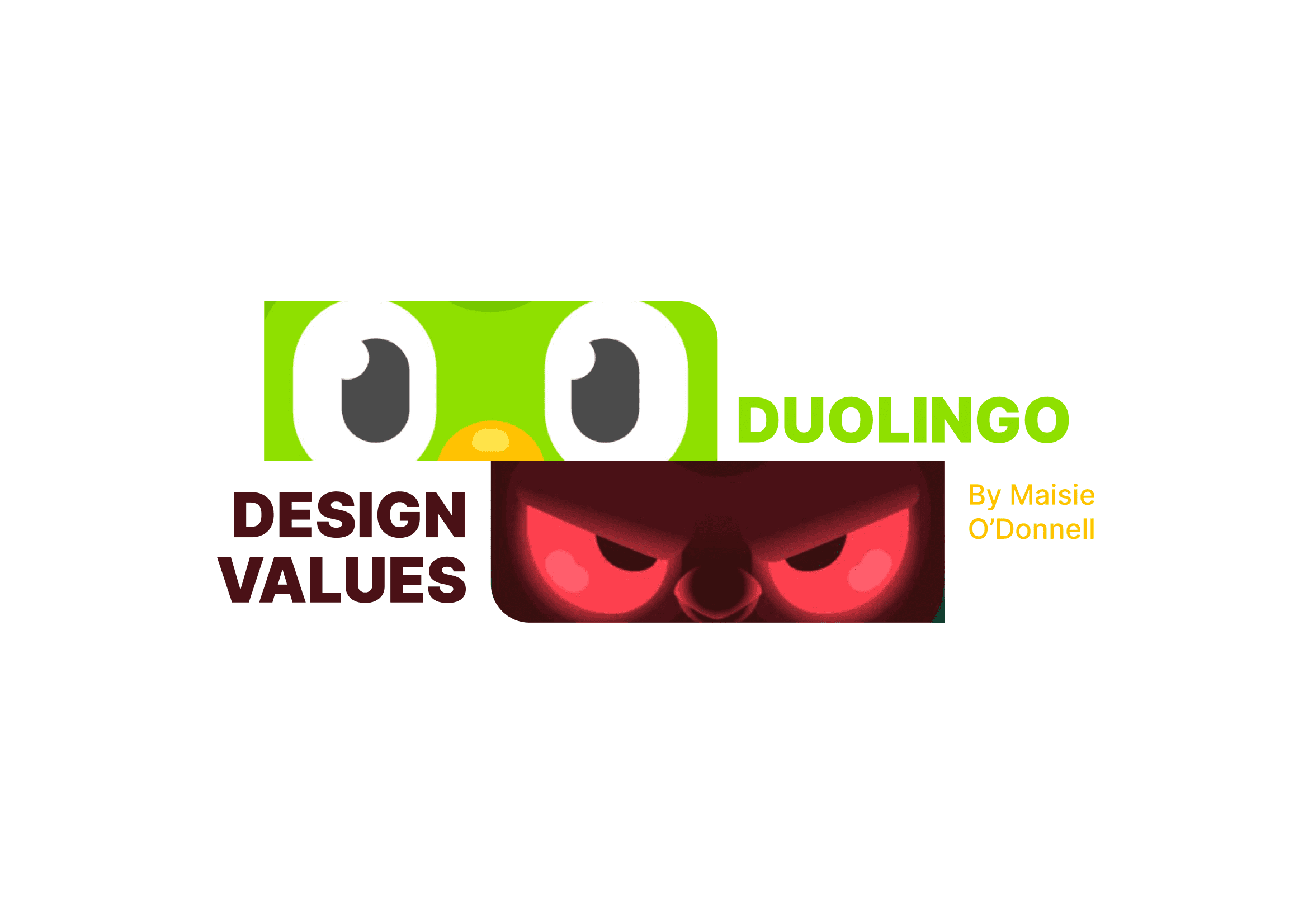
Duolingo Ethics Analysis
Reviewing the design values and UX patterns of Duolingo as an educational product to produce an ethical assessment, with suggestions for improvement.
5 min reading time
DURATION
2 weeks · 2023
CLIENT
university Masters project
TEAM
solo
TOOLS & SKILLS
research · design analysis · UX writing · product design · Figma
DELIVERABLES
report
Project Details
As designers, we have the responsibility to consider the gravity of our design decisions, including the wider sociocultural impacts and implications. This report explores the tensions that can exist between values and UX, as shown in this case study on popular language learning app Duolingo.
CHALLENGE
Research in design helps us understand the impacts of the design decisions we make. In this report, I explore and assess the role of values in Duolingo’s design and how UX/UI decisions align with these values.
SOLUTION
I expand on my research findings in a two-part report with references, including a visual concept for a design recommendation.


Background Research
This report was guided by research sourced from reports and articles from literary journals and published online. My search aimed to take an unbiased stance on the product’s decision to gamify an educational tool, but ultimately was determined by the literature’s conclusions.
PROCESS
My background research process involved using key words to identify material relevant to this case study. I used both web search engines and literary databases to ensure breadth of information.
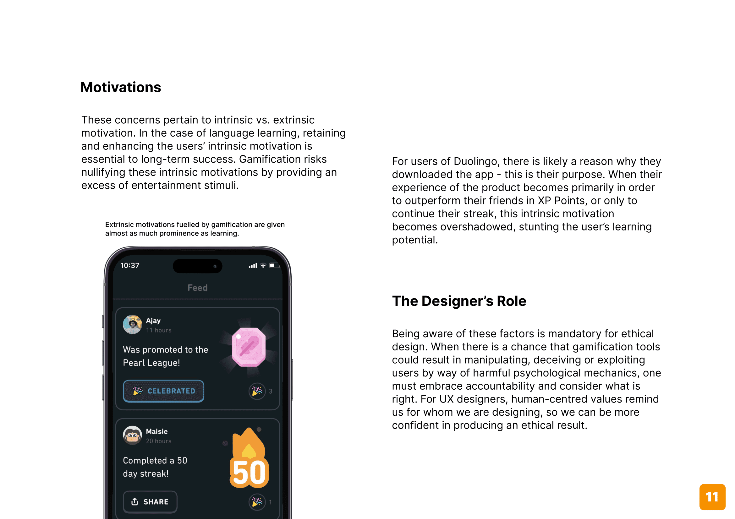
The following themes were noted under three focus areas as being relevant to Duolingo’s values and/or UI/UX experience:
1
Gamification
See also: addiction, dopamine, dark patterns, psychology, engagement, retention
2
Education
See also: learning
3
Interaction design
See also: streaks, feedback, haptics, rewards, randomised
The material showed that these areas overlapped significantly in the case of Duolingo. This specific combination of factors made for a murky context.
Ideation
The body of the final report is divided into two sections: analysis, and improvement.
PART 1 / Values Analysis
This section introduces Duolingo, including a brief description of its history, business model, and market competition. The content that follows is dedicated to an overall consideration of the product’s purpose and its dominant UX patterns.
PART 2 / UX & UI Ethics Alignment
The second part of this report focuses on some of the ways UI and UX have been implemented in the design. The discussion considers whether these choices align with the values mentioned in Part 1. I offer three recommendations and demonstrated an example of one of these, showing how it might be improved.
APPROACH
I chose to write this report in an approachable way that uses common yet professional language and short paragraphs to communicate the findings. I included visuals to support the ideas mentioned in the body text and structured the report with a generous use of subheadings. The flow of the report opens with an introduction to Duolingo and touches on some important aspects for the reader to understand in order to fully appreciate the conclusions later reached. A reference list enrichens the experience for those who want to read further or check sources. The design suggestion is accompanied by a visual representation to provide a visual demonstration and create buy-in.
Report


Reflections
UX is a balancing act
Design decisions sometimes feel like they exist in a strange relationship that weighs up what's best for the user and what's best for the business, as if they're on opposite ends of a spectrum. These considerations can seem at odds, but centring the user's needs ultimately serves business interests in the long term in terms of creating and sustaining a user base.
Decisions are never neutral
Though many decisions made within the confines of a design project can feel isolated from the rest of the world, there's an intimate connection between our actions as designers and real world problems that resonate with our own values. Nothing we choose to do within a Figma file is without consequence.
If it's not reflexive, it's exclusive
It's all too easy to fall into the trap of designing for ourselves. When we design without considering how the broader user base might engage with a product, we discount the validity of their experiences. The more we reflect on how those who have backgrounds or views different to our own might experience the product, the closer we become to inclusive, universal design.
Want to see more?
REPORT PDF
This report can also be viewed as a PDF.
REPORT