One NZ Design System
Creating a comprehensive interactive design system demonstrating foundations and elements for One NZ’s website.
4 min reading time
DURATION
3 weeks · 2023
CLIENT
university Masters project
TEAM
solo
TOOLS & SKILLS
product design · design analysis · UX writing · prototyping · Figma
DELIVERABLES
design system · interactive prototype
Project Details
One NZ is a telecommunications company and New Zealand’s largest wireless carrier, providing customers with mobile and broadband services. This project documented a design system for their website, one.nz
CHALLENGE
There is a pattern of graphic and UI elements used throughout the one.nz website, from the way type is formatted to the use of colour to signify action. Creating a design system for these patterns helps designers make more informed and efficient decisions in future iterations, as well as promoting scalability. For this project, the design system would need to be reverse engineered from code, requiring a basic working knowledge of HTML and CSS.
SOLUTION
A hi-fi microsite, prototyped in Figma with navigation and interactive elements, documents the design foundations and elements of One NZ’s website. The solution uses UX best practice techniques to ensure the microsite is easy to navigate, clearly and accurately communicating the design to foster consistency in future developments.

Precedents
To familiarise myself with the structure and content of industry-standard design systems, I researched established examples that are open to the public.
I recognised some commonalities between the examples from large companies with dedicated design teams.
1
Information Architecture
The content has been organised in a methodical way that is easy to navigate. Categories are standardised and finding the right content is intuitive.
2
Visual examples
There is a close relationship between text and visuals. Foundations and components are not only shown - they’re demonstrated.
3
Depth of detail
To develop an understanding of form and use, there is a high level of detail required. This provided sufficient context for each asset.
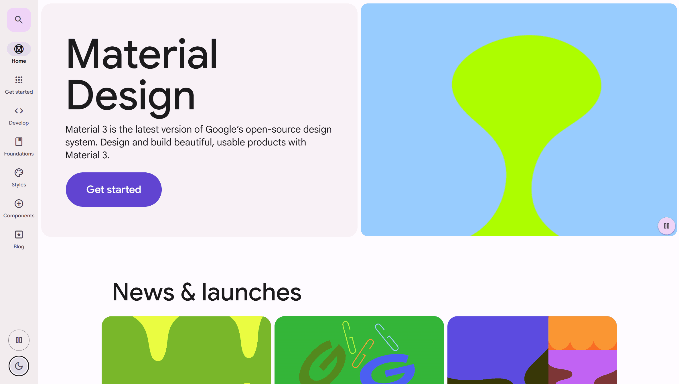
Material 3 (Google)
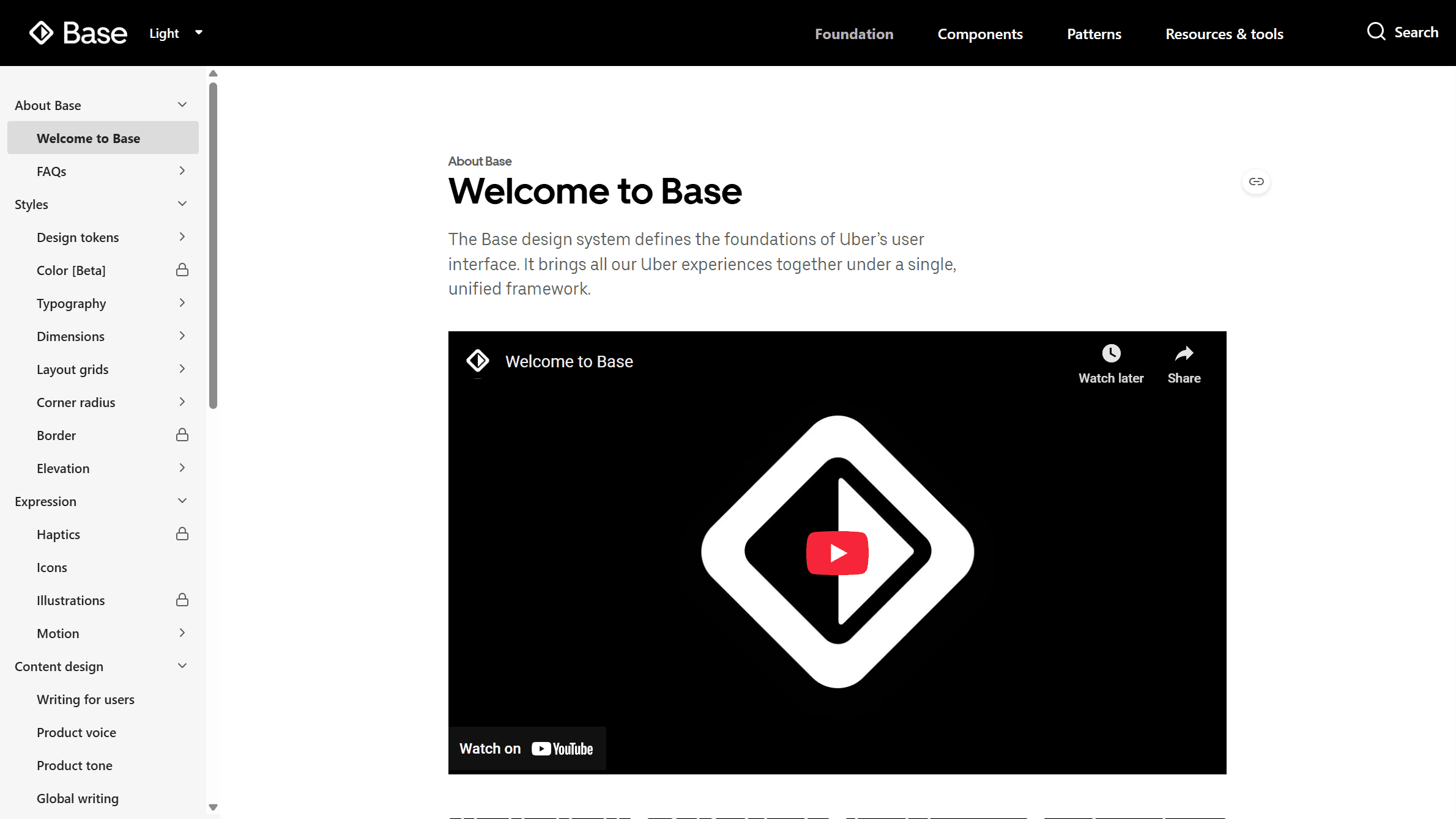
Base (Uber)

Atlassian

Polaris (Shopify)

Lightning 2 (Salesforce)
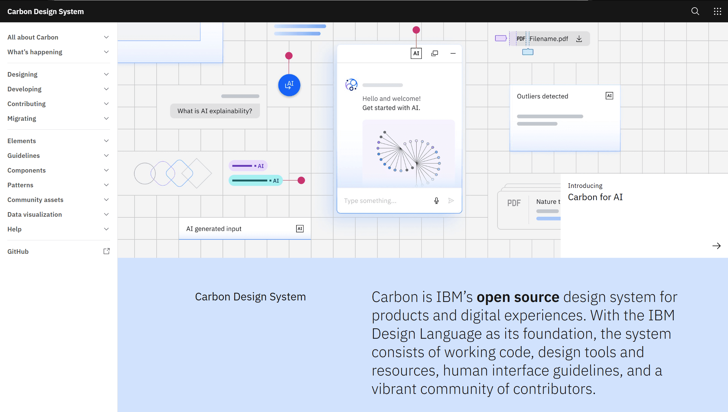
Carbon (IBM)
Ideation
The brief for this project specified that the design system must explore the design foundations for the site as well as five interactive elements.
FOUNDATIONS
This section includes brand identity, colour use, icons, type, photography and language.
INTERACTIVE COMPONENTS
I chose to focus on those that made the most significant impact from a UX perspective. Components included buttons, accordions, input fields, navigation/menus and their custom dial picker.
USING HTML AND CSS
Using the Inspect tool to view the product’s code and by taking screenshots, I analysed the websites interface, taking note of key variables.


Using the Inspect tool to view code for body text
and for CTA buttons.
I reviewed the site for consistency across pages and in different contexts to see if elements appeared and behaved the same in each instance. This helped me to identify the specific application for each element and discover what the variation signified.
After collecting examples of elements across the site, I analysed them to discern their UX function. Some appeared to be outliers - inconsistent with the others in some way without rationale. These were not included in the final prototype.
Prototype
The MVP prototype documented key elements and components for a One NZ design system across eleven pages.
Reflections
Details are your friends
Consistency is better achieved when things are documented in explicit detail. By detailing the tokens, it is easier and more efficient to build and use interfaces that are both beautiful and functional.
Prioritise function and adaptability
Designs systems are an opportunity to enhance a product on multiple levels. They should coherently express brand image and voice, but also importantly improve the user’s ability to achieve intended tasks. These change over time and the system must accommodate this evolution.
Make difference meaningful
If you choose to make an element look or behave differently, let there be reason behind it. Differences indicate function to the user, and lack of intentional consistency can result in a complicated experience.
Want to see more?
PDF VERSION
This design system can also be viewed as a PDF.
DESIGN SYSTEM